
|


Tutoriel MySQL - Highstock
Highstock What is it?
It is a library like Highcharts, but with features and options.
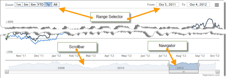
The main differences are the "Range Selector" the "Scrollbar" the "Navigator" and the grouping function values??.
To see the difference, we will create this graph Before you begin, you must download and install the library Highstock
We start our new file, as the previous ones, with the connection to the database and the table
require("mysql_connect.php");
$sql="select max(tstamp) from MiniMaxidata";
$query=mysql_query($sql);
$list=mysql_fetch_array($query);First change you'll notice that we will not use the table "data", but "MiniMaxidata" table.
Why?
If your station records a value every 5 minutes, you have a day to 288 values ??to be loaded into the
table MiniMaxidata there is already a field "Rain_jour" which is the total rainfall in one day.
So that's 288 less per day data to trace, 365 for one year instead of 105'120, this will greatly
faster loading of our chart.And recovering the time the "Rain_jour". Because we want to retrieve all the values ??in the table, it does not indicate a start and stop The remaining portion of the PHP does not change other graphics
$i=0;
while ($list = mysql_fetch_assoc($query)) {
if (date("I",time())==0) {
$dtime[$i]=($list['tstamp']+3600)*1000;
}
else { $dtime[$i]=($list['tstamp']+7200)*1000;
} $Rain_jour[$i]=$list['Rain_jour']*1; $i++;
}
?>The HTML part does not change. Now we call the Highstock bookstore, it's the same principle with Highcharts.
<script src="../highstock/js/highstock.js"></script>
<script src="../highstock/js/highcharts-more.js"></script>
<script src="../highstock/js/modules/exporting.js"></script>
<script src="../highstock/js/themes/grid.js"></script>Checking and changing the paths The first instructions of the graph does not change the previous graphs.
function comArr(unitsArray) {
var outarr = [];
for (var i = 0; i < dTime.length; i++) {
outarr[i] = [dTime[i], unitsArray[i]];
}
return outarr;
}
$(function () {
Highcharts.setOptions({
});We create the graph itself: window.chart = new Highcharts.StockChart({
chart: {
renderTo: 'container',
zoomType: 'x',
alignTicks: false,
},First innovation, the rangeselector

The options are available in the API http://api.highcharts.com/highstock#rangeSelector.inputEnabled
I will explain the basics, insert this code: rangeSelector : {
buttonTheme: {
width:70
},
buttons: [{
type: 'month',
count: 3,
text: '3 mois'
}, {
type: 'month',
count: 6,
text: '6 mois'
},{
type: 'year',
count: 1,
text: '1 an'
},{
type: 'all',
count: 1,
text: 'Tous'
}],
inputEnabled: true,
selected : 3,
},We have created with this code 4 buttons with a width of 70 pixels, for each button you can define a range to be plotted or
"day" "month" "year" "YTD" or "all" and for each track lasting , for example 3 days, 4 months, 2 years, etc.Exemple:
Example:type: 'month',="month" range is defined
count: 3,=is defined as the range will be three months
text: '3 mois'=we put the text you wantinputEnabled: true, displays the calendar on the right, set to false to hide
selected : 3,indicate that an opening of the graph is the third button is selected, you do not count the first, so
in our example it is the last button (4th) "all" that will be active at the opening of graphic
Subsequently, ie the title, axes the tooltip, and other options do not change compared to Highcharts, so I just put the code to recall:legend: {
enabled: true,
align: 'top',
layout: 'horizontal',
verticalAlign: 'top',
y: 10,
x: 20,
shadow: true
},
title: {
text: 'Pluviométrie détail par mois depuis 2011',
style: {
color: '#000000',
fontWeight: 'bold'}
},
yAxis: [{
labels: {
formatter: function() {
return this.value +' mm';
},
style: {
color: 'royalblue'
}
},
title: {
text: 'Pluviométrie',
style: {
color: 'royalblue'
},
}
}],
tooltip: {
formatter: function() {
var s = '<b>'+ Highcharts.dateFormat('%B %Y', this.x) +'</b>';
$.each(this.points, function(i, point) {var unit = {
'Pluviométrie ': ' mm'
}[this.point.series.name];
s = s + '<br/>' + '<span style="color:'+ point.series.color +'"></span>'+ point.series.name + '<b>'+Highcharts.numberFormat(point.y,1,","," ")+'</b>'+ unit;
});
return s;
},
shared: true
},Other novelty grouping of "dataGrouping" data As Highcharts data y axis is defined: series: [{
name: 'Pluviométrie ',
type: 'column',
color: '#1e90ff',
data: comArr(Rain_jour),
},
]
We just changed the type of curve, line, column "column"Now the group function is added in our series. series: [{
name: 'Pluviométrie ',
type: 'column',
color: '#1e90ff',
data: comArr(Rain_jour),
dataGrouping: {
units: [[
'month',
],]
},
},
]Look at the two charts below, I simply replaced day by month and nothing else
month day So by changing a single parameter, you change from a monthly total daily course in the second graph we must
also change the title and change the tooltip to display the dateDownload the file 


|
|||||||||

|
Station
Davis Vantage Pro 2 + station agricole - Weatherlink
6.0.0 - GraphWeather
3.0.15
© 2010-2013, Météo Villarzel - Webmaster Aubert Pierre-André Attention, les données météo publiées sur ce site sont issues d'une station météo personnelle et ne sont données qu'à titre indicatif, elles ne peuvent en aucun cas être utilisées pour garantir la protection des personnes ou de biens quelconques. |
|||||
|
Stations amies
|
|||||
|
|
|
|
|
|
|